How to gain a 30% boost in conversion with the same content or functionality?

How to make your product act as a user magnet with Aesthetic-Usability Effect
By having a great user experience and a flawless interface may sometimes not be sufficient to make a person stay on your website. The Aesthetic-Usability effect is a major factor when it comes to making that decision. With a variety of applications, it can be used in almost any industry ranging from coffee shops to a technological enterprise. In this post, we will review how this effect can be useful in terms of digital products’ efficiency.
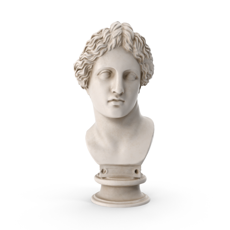
So how does the Aesthetic-Usability effect work?
Aesthetics-Usability is closely tied with Users’ emotions and is usually associated with the whole picture being especially prominent in the testing stage. You may notice the testers paying too much attention to visual parts, rather than the functional part like in the structure and layout of the website. With their feedback being positive - this will let you know you’re heading the right direction.
The Internet tends to be quite fast-paced and there is a very short time period for a human to decide whether he wants to stay on the website. It’s just about 10-20 seconds. If you successfully used it to your advantage, it will lead up to a 30% increase in conversion. Ain’t that exciting?
A great example is AirBnB. As you probably know, they’re huge now, but there were times when they were about to go bankrupt. They started to spend hours on the website looking for their flaws and found out many listings that do not provide good pictures of the living space. So they traveled to New York, rented a camera and spent some time with the hosts to improve their listings. At the end of the story, this idea pulled out AirBnB from an edge of bankruptcy. Their revenue multiplied within one week after they started using high-quality pictures for their premises.
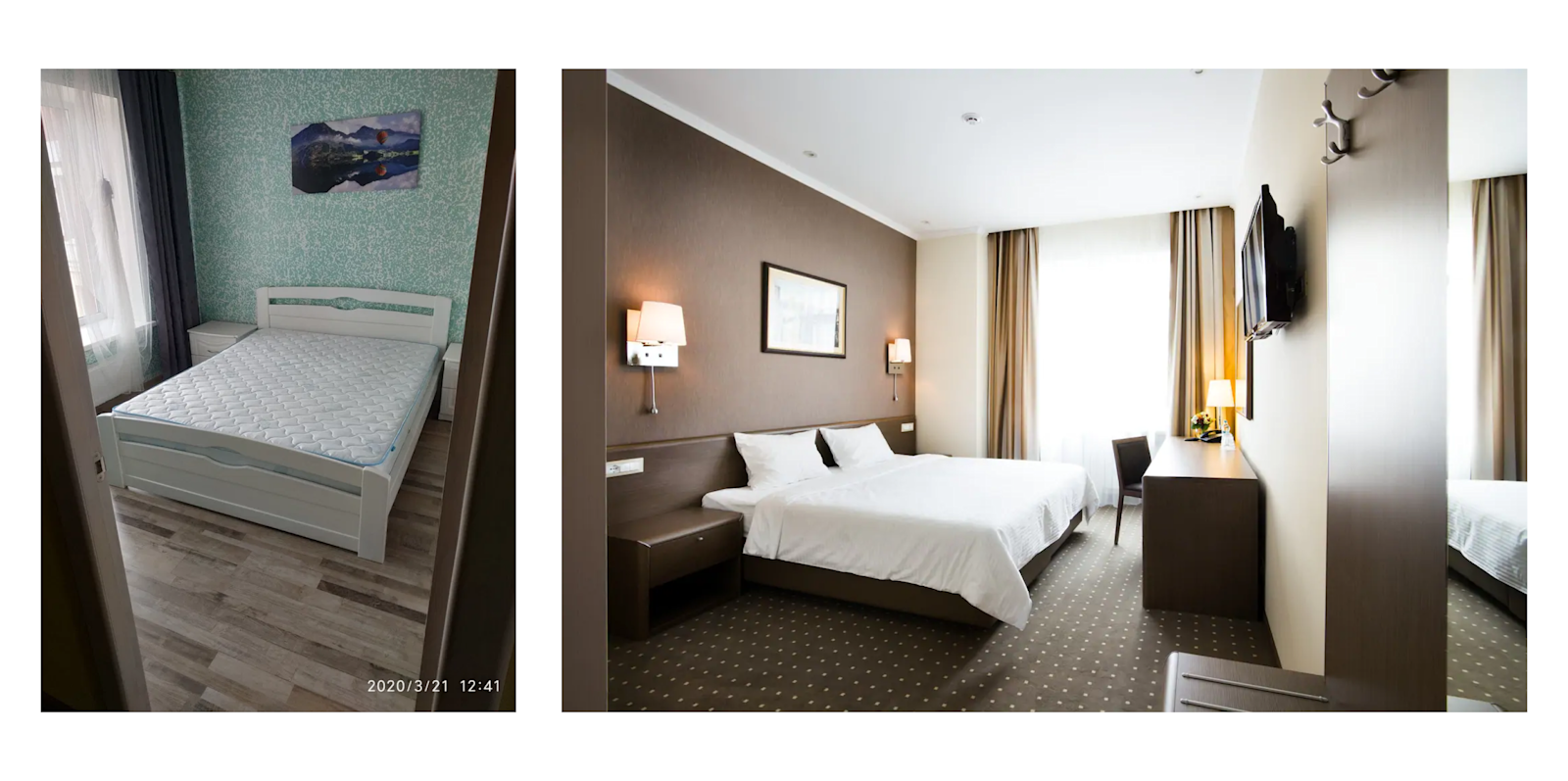
Below are a few real-life examples of digital products we’ve worked on:
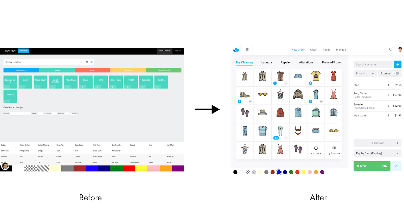
CleanCloud, a POS software provider for laundry and dry cleaner businesses.
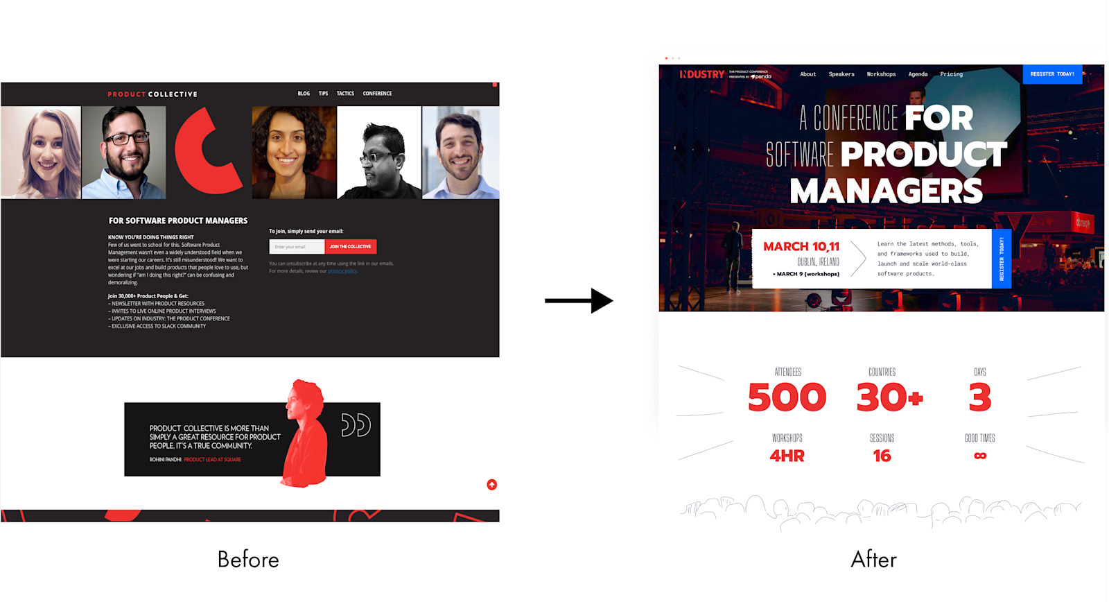
Product Collective. Industry Conference website revamped.
And here is a new version of Industry Conference pop-up:
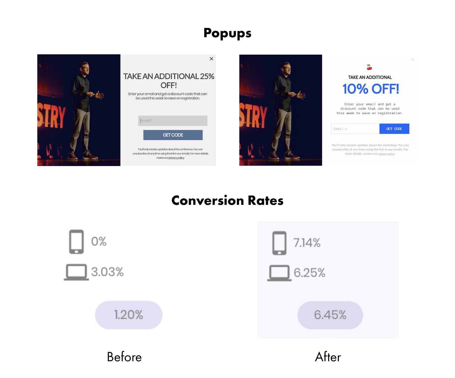
Not too much of a structural change but the numbers speak for themselves. 2x in conversion on PC platforms.
“Hm. Seems like some deceptive marketing...”
Not deceptive if you have a good functioning product! It indeed has some drawbacks. Squeezing the most out of the Aesthetic-Usability effect may cover up some existing issues with UI/UX, and you might be only tricking yourself here. It only works for the short-term and you have to remember that if your intention is to provide the best experience, so a single “prettying things up” trick won’t cut it.
Sooner or later, users will find that the website is painful to use and will give up using your product or service. The foremost reason is that people are actually looking for something that can fix their troubles and help them reach that sweet state of comfort.
“Okay. My product's functionality is on the level… How do I make things pretty?”
There are tons of design systems containing guidelines out there, so thankfully it’s not as difficult as it seems. For over 3 years we’ve been developing our own Design System called .pulse.
It contains a large variety of design rules and guidelines that are based on our rich experience working with digital products. Also, there are sections containing tips on how to prep up your existing website design to reach that state of a balanced and attractive look. You can start improving your existing product now by applying at least a fraction of what’s there :)

Trusted by startups with $200M+ in funding:
Partners backed by:


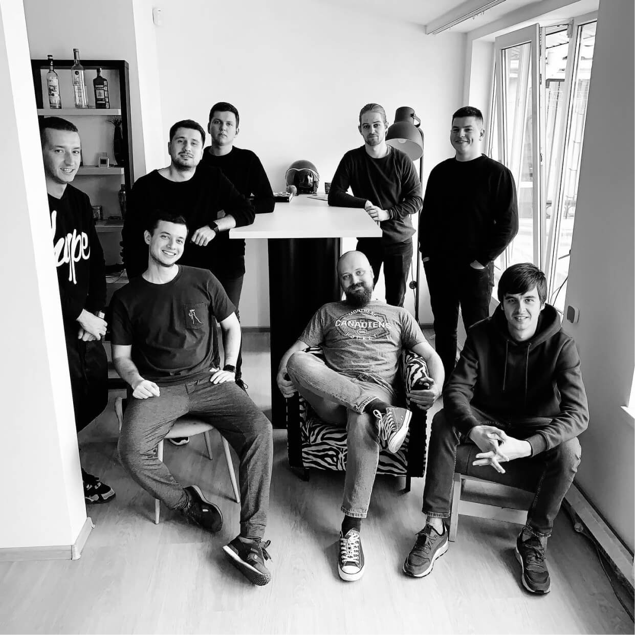
Small = effective
We are surrounded by amazing cultural and physical weather climates. Our HQ is located in Odesa — a beautiful seaside resort near the Black Sea. Anton Checkhov lived in this same neighborhood, and we are just one minute away from the opera house where Tchaikovsky conducted.
- Working with founders from Y-Combinator, US SaaS awards winners, guys from Forbes, Business Insider, Daily Beast etc.
- 6 years with same leadership team structure — right people at right seats
- Creative Director — Awwwards International Jury
- Got more than 100000+ followers across all design social networks
- Companies we’ve worked with got more than $200M+ in funding
- Spent $200,000 building our in-house web-app
