Achieve 20% more work. Or a trick on how to get an "extra employee" for free.

Gain a 20% boost in team efficiency without sacrificing your budget. Or how to get an extra employee on board.
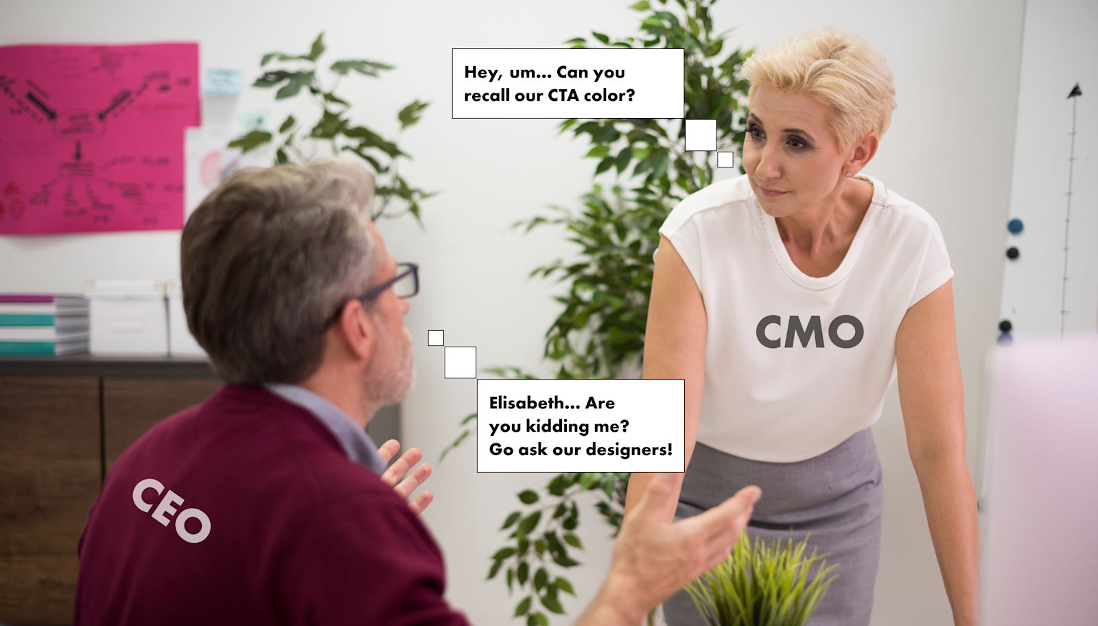
A lack of shared visual guidelines is often present among digital product teams. Everyone has different roles and is specialized in different product areas. And by not having straightforward design guidelines that are shared among the whole team, it’s hard to gain quality traction for maximum efficiency.
Design is an area that always involves nearly every department. Everyone is more or less involved with it when developing some new design experiences for a digital product. It becomes very difficult for your team members to stay on track with the design and not to bug the designer team too much. Every small interaction adds up, and it results in hours of time spent on needless discussions and ping-pong play.
The reason for it being is an outdated approach to design documentation. When executing any task, every team member thinks within the context what would be best for him/her. Hence, with no shared rules in place, the employee is then unable to do it in the “best for the product” way.
Cut 20% of time on interaction = get 20% more things done.
Picture yourself a situation. You have a VP of marketing trying to create a new product presentation for investors in such a way that corresponds with a product’s design. He or she then jumps to a reference that is often kept as a PDF document stored somewhere on G Drive. It contains design guidelines but no one knows if it’s up to date. So it then leads to multiple checks with a design team on its relevance, and moreover, it might even have some things missing there. This way of storing your design guidelines may be considered as good as if they were not even existent.
Obviously, the VP of marketing will refer to a designer with endless questions about headings, fonts, colors, etc. It creates extra mini-steps between each department and results in a huge time loss. Imagine one person wasting up to 5 minutes on discussing minor issues, two people - this time doubles. And remember that salaries are different, and the cost of time spent on needless interaction drastically increases the higher a job title is.
But what if you could have everything nicely stored within just one click away? One link, one version that’s always up to date, and no needless interaction… Those micro-interactions regarding design issues result in 20% loss of time. That is if you could have 2 extra people on your team for free, given the total number of team members being 10.
There is however a way out of this situation. A Style Guide, or its more complex sister - a Design System. It’s a single source of truth that everyone can refer to. An example of such Styleguide is shown below:
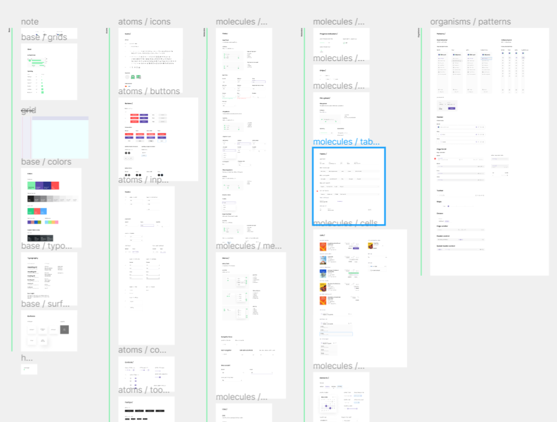
What is a Style Guide or Design System, and how exactly they work?
At Heartbeat, among the most valuable things we deliver to our partners, besides some awesome looking designs, is a solid design foundation in the form of a Style Guide or sometimes a full-blown Design System for maximum team traction. Where traction is the team’s work process that everyone follows and believes it. A one that’s continuously being improved, always on the surface, and easy to access. It will allow every team member to create consistent design experiences.
Styleguide. It must be a Guide full of styles eh?
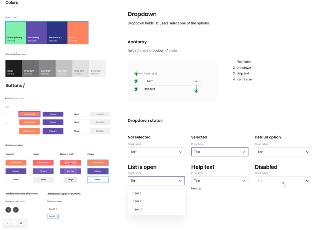
A small portion of the Styleguide is shown above. It’s a component library (We use Figma to create and store these) fused with Atomic methodology. Components work here as Lego building blocks that have a naming convention in place and store a set of CSS properties that can be easily looked up. They can be broken down into essential parts:
Base components: Foundation for everything else below. A grid & spacing system, colors, typography, surfaces, etc.
Atoms: Smallest components such as icons, buttons, inputs, controls, etc. Singular components.
Molecules: A step up from atoms. Components such as fields, menus, lists, tables, cells, notifications etc.
Organisms: Larger components, or patterns. Full templates for panels, headers, toolbars, and similar blocks.
Literally, everyone obtains the same vision on the design, that in fact removes confusion among departments. Anyone could visit the Styleguide, look up properties about anything needed, or as an instance - copy a pattern to work out something design related.
Design System. How is the different from the Styleguide?
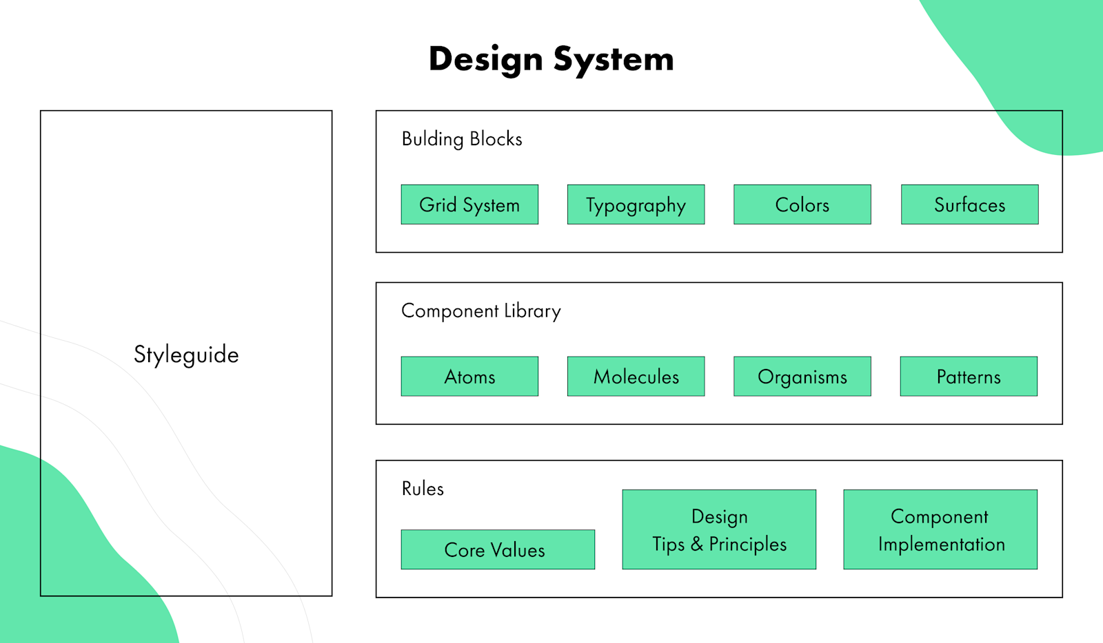
It’s a step above the Styleguide with higher complexity but with even greater benefits. A flushed out Design System will contain some internal company values, guidelines on implementation and other rules for consistency and balance.
You can even further by transferring the components to React for your Developers. It will make their life much easier by removing the need to even think about design as part of their daily job.
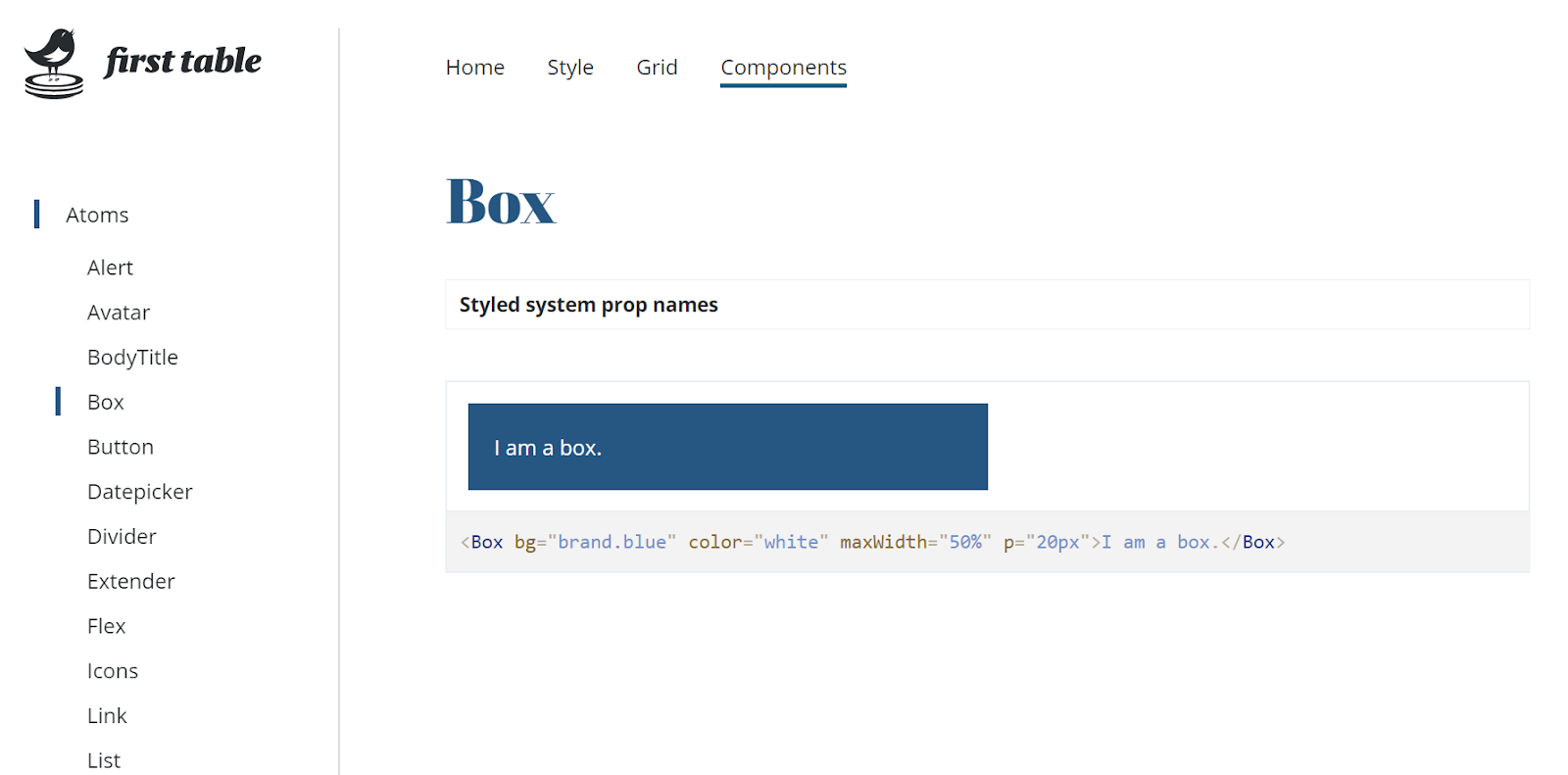
By the way, we have our own Design System called .pulse, check it out. It was added top Github design system repository called “Awesome Design Systems” along with other world-class design systems from IBM, Google and Atlassian, etc.
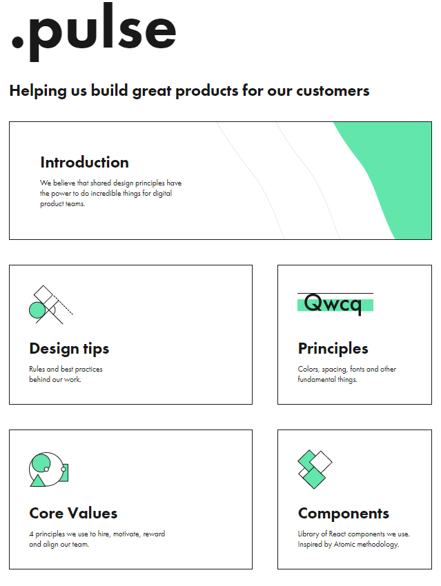
Besides, in 2019, we’ve got a chance to have a brief discussion over our design system with folks at Dribbble, and afterwards it was highlighted in their article “What are Design Systems?”.

Trusted by startups with $200M+ in funding:
Partners backed by:



Small = effective
We are surrounded by amazing cultural and physical weather climates. Our HQ is located in Odesa — a beautiful seaside resort near the Black Sea. Anton Checkhov lived in this same neighborhood, and we are just one minute away from the opera house where Tchaikovsky conducted.
- Working with founders from Y-Combinator, US SaaS awards winners, guys from Forbes, Business Insider, Daily Beast etc.
- 6 years with same leadership team structure — right people at right seats
- Creative Director — Awwwards International Jury
- Got more than 100000+ followers across all design social networks
- Companies we’ve worked with got more than $200M+ in funding
- Spent $200,000 building our in-house web-app
